Images to include in a press kit
Great image resources can significantly improve your chances of having an article written about your app. It is about making it as easy as possible for a journalist to cover your app.
Some images are more straightforward to prepare than others. We'll start with the easy ones.
Screenshots
You should never copy your App Store screenshots to your press kit. Because most likely, these are the “fancy” variant with colorful backgrounds and extra text. These look great in the App Store but not so on websites.
The most important images are plain screenshots. Meaning screenshots without any extra modifications - even device frames. These give journalists the most flexibility. You can also include “framed” ones, but only as an addition.
It is also essential to have up-to-date screenshots. To show that the app is in active development and best represent it.
Feel free to include screenshots with up-to-date device frames, but always provide the plain ones as well. You can get the device frame straight from Apple.
Other essential tips apply. Show the best and most exciting parts in as real scenarios as possible. It does not make much sense to show about screen here.
TIP: If your app relies a lot on user-generated content, it is worth preparing a nice demo one you can quickly turn on. Having great demo content will make creating new screenshots much more effortless and increase the chances of keeping them up to date.
Banners / hero images
Most websites have 16:9 or similar header images for articles. If you can provide a suitable one, the journalist doesn't have to create it or reach for a stock image.
In my experience sending out press releases, I have seen my banners used pretty often. My apps most often get shorter news type of coverage which usually has single image (the header one) and these banners are perfect fit.
Banners can be straightforward if you are comfortable with graphic design software and want something basic or a big task for fancy banners.
Simple banners
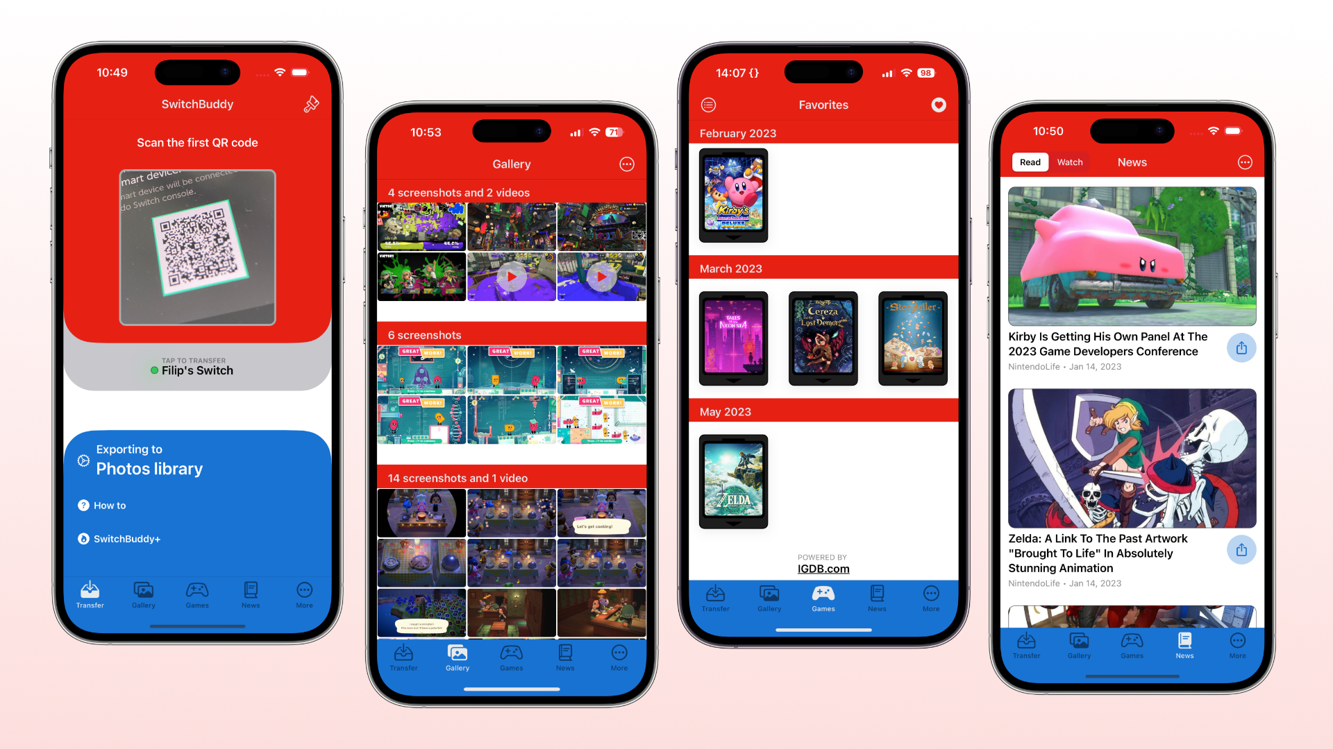
You don't need to overthink banners. Simple ones are enough. For example, you can create a Full HD banner with a pretty gradient background that just shows your app's three or four framed screenshots. Below is an example:

Apart from aligning the screenshots, this does not take much skill, and you have something the press can readily use as a header image for the article.
I recommend using this gradient generator for best results. Use the "Export as SVG" button for your graphics software.
Lifestyle photos
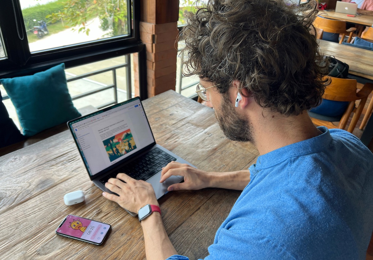
These are the most complex to make; however, they make for great headline images and sharing on Twitter. You can try finding a suitable template online that will let you drop your screenshots, or if you have two phones or a dedicated camera, you can create these yourself.
I think having iPhone/iPad in the center of the frame with your app and some decorations around it on a nice background is more than enough. Match the decorations to your app's theme. So maybe if you have a tasks app, you can have a notebook, pen, and other "productivity" tools in the shot. Or you can show a person using your app. As this example from Posture Pal shows:

You can also use these sparingly to spice up your text description of the app.
Tips
Don't forget that ImpressKit lets you reorder images as you see fit - so you can first have the most important.
And make sure to tag them. Like "iPad", "iPhone", "Banner", "Lifestyle" or based on feature areas of your app.
Recap
Plain (or "RAW") screenshots are the most important assets you should provide. If nothing else, definitely offer a few up-to-date screenshots. And ideally also make sure to have at least a single wide banner or nice lifestyle photos to make it easier for the press to make it easy for them to have header image without extra work.
My experience
As I wrote in the banners sections, for my coverage, the press picked banners and lifestyle photos quite often for the coverage. I have also seen a couple where my plain screenshot was inserted into lifestyle photo template and the result was pretty nice.
My lifestyle photos showed quite old version of the app which apparently wasn't a big issues. I guess it depends on what parts of your app the lifestyle photos show.
When & how to write a press release
Press releases are a great way to get attention to your app once the initial launch phase is …