PRESS RELEASE
Jan. 3, 2023
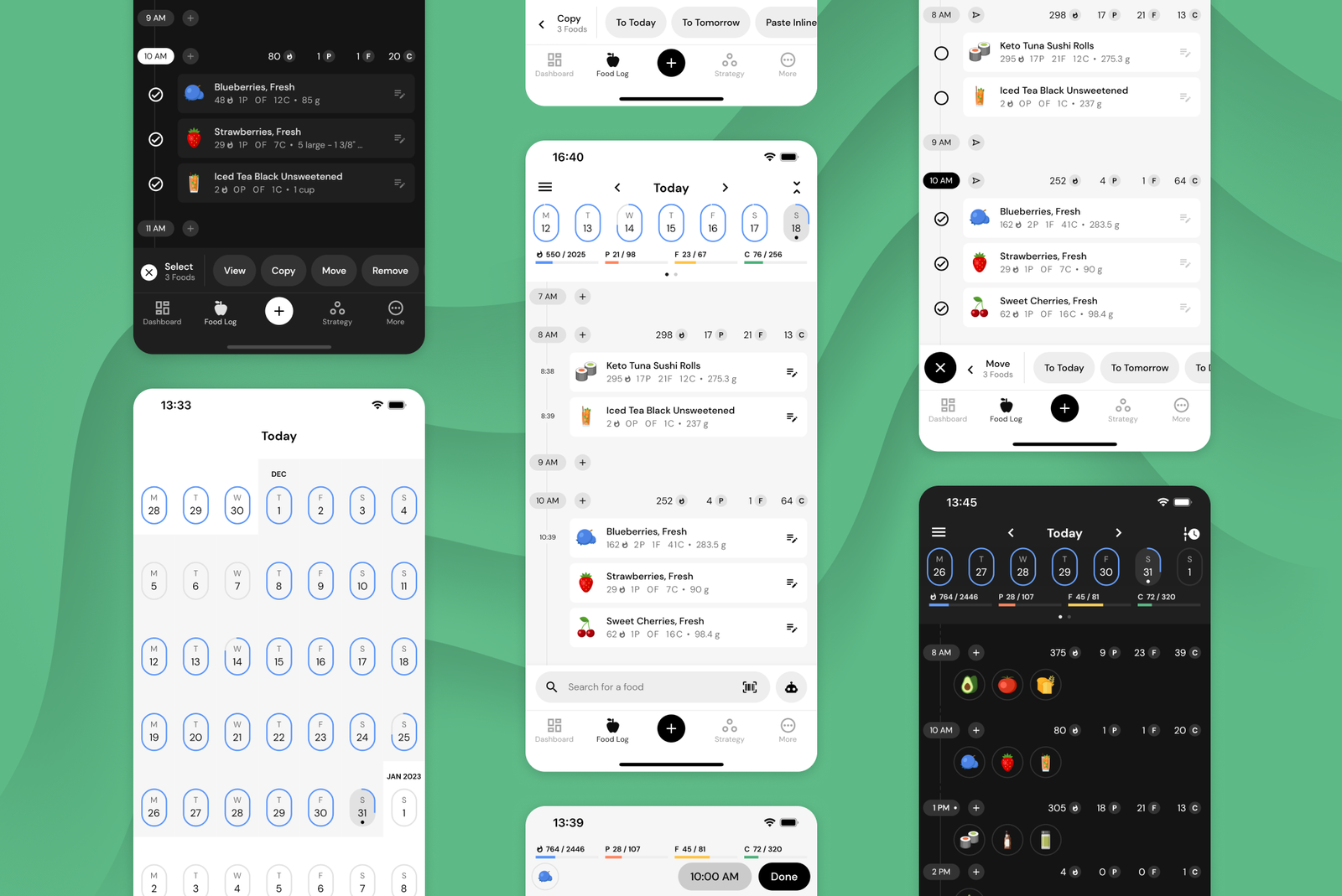
MacroFactor Advances Macro Tracking with its Timeline-Based Food Log
MacroFactor launched in September of 2021 with market-leading diet coaching algorithms and a novel concept for its food log. Instead of representing the user’s day with “Breakfast”, “Lunch”, and “Dinner” buckets you may find in apps like MyFitnessPal, LoseIt, or Noom, MacroFactor represents your day as an interactive timeline. When a user logs foods, those foods are associated with a particular point in time, instead of a predetermined bucket.
The timeline system has several advantages over bucket-based food trackers and aligns with MacroFactor’s adherence-neutral philosophy:
- The timeline represents the day as it is rather than what it “should” be. Three square meals a day is a nice expression, but it is seldom the reality on the ground. Some MacroFactor users are on the go all day and eat 5+ small meals in between meetings; others partake in intermittent fasting protocols that limit their feeding window to just a few hours. Plans change, co-workers spontaneously treat us to home-baked goods, and the timeline accommodates all of it. MacroFactor users eat foods when they eat foods, and that is precisely how they log them, whether or not their intake is perfectly congruent with traditional eating windows or meal structures.
- The absence of rigid buckets encourages users to track their intake. If a user adopts a predetermined meal schedule (e.g., breakfast, lunch, pre-workout, and dinner) but ends up deviating from their intended schedule, they may feel discouraged from logging that off-schedule bedtime snack. After all - it’s not quite dinner! Unlike traditional food loggers that primarily enumerate consumed foods, MacroFactor goes a step further and uses logged foods to make smart macro program adjustments week over week. To get the best analytics from the app, users need to track their complete intake. The absence of artificial constraints makes it easier to represent their entire day accurately.
- Logging foods by time removes decision fatigue from categorizing foods into buckets. If you ever had a protein bar once you arrived at the office and wondered, “Should I log this as breakfast or a snack?” - you can imagine the toll of making such micro decisions multiple times a day, 365 days a year. On the mission to create the most efficient food logging workflows in existence, the MacroFactor team quantified food logging workflows of 20 food tracking apps on the market and designed a food tracking system that outperforms all of them. Removing unnecessary decisions is part of creating that snappy and delightful food tracking experience. When a MacroFactor user tracks their food, all they need to do is tap +, choose the food, and log it. MacroFactor’s logger will automatically associate a time with the food and place it into the day’s timeline.
As with all new things, the food log timeline, which launched in September 2021, had a learning curve for users and unrealized potential for development. Feedback and feature requests streamed into MacroFactor’s Roadmap Portal, Facebook Community, and Reddit Group.
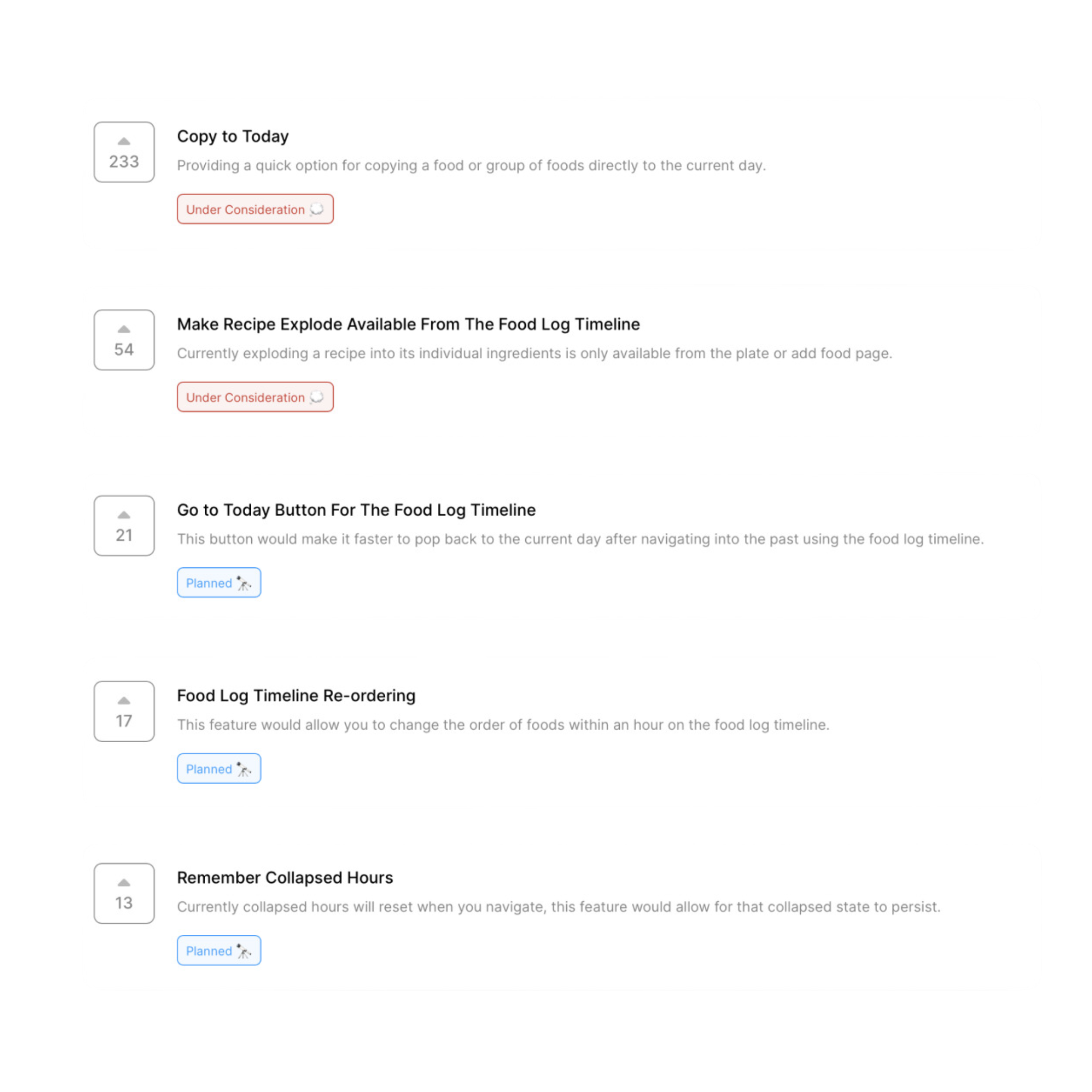
Over 500 feedback submissions, 11 cycles of design, and a 1400-participant beta later, we are excited to announce that Timeline 2.0 is finally here.
Starting January 3, the revamped food log timeline will begin rolling out to our users. It has a new look, powerful tools for meal planners, enhanced timeline interactions, and at-a-glance summaries for the fastest, most comfortable food logging experience yet. This major release reinforces the timeline vision for the food log while delivering on more intuitive interaction patterns.
Ultra-fast, in-the-moment food logging meets rich metadata
Users who log in the moment during each meal can use the Search Toolbar that is available from any primary app page to immediately engage the Food Search and add one or more foods in a few taps. MacroFactor’s food logger will automatically associate a timestamp with all of the logged foods and place them in the current hour on the timeline.
With Timeline 2.0, those foods will be displayed in the timeline with minute-level precision so you can get more data as you track your meals without the extra work of manually specifying timestamps.
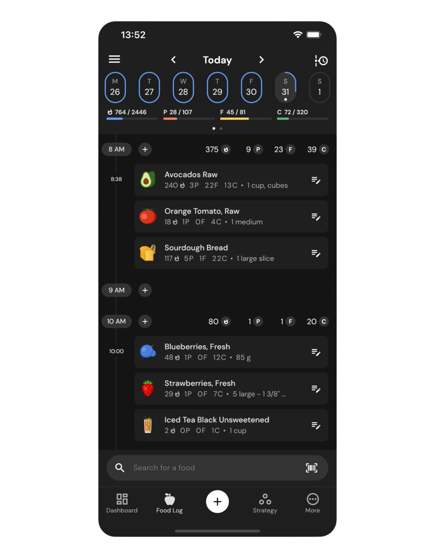
As you log throughout your day, MacroFactor will use those timestamps to update the nutrition profile of your day and each hour within it. The timeline will display hour-level macro summaries above each hour, so you know how your macros compare across meals and how those meals impact your daily nutrition targets.
Users can show and hide food-level timestamps and toggle hour-level macros to switch between a light, spacious timeline view and a more information-dense view for key use cases.
Meal planners can now leverage the most powerful system for manipulating logged foods
Timeline 2.0 brings sweeping enhancements to Move, Copy & Paste, Edit, and Delete capabilities with a new Tap-to-Select system for food tiles. This system decreases the interaction cost of popular food log workflows across the board by leaning on MacroFactor’s reimagined clipboard feature.
Users can tap on any food to add it to MacroFactor’s list of selected foods and then continue choosing foods across multiple days. To make a selection even faster, MacroFactor enables you to select entire hours by using the Hour Button or entire days by using the Select Day option.
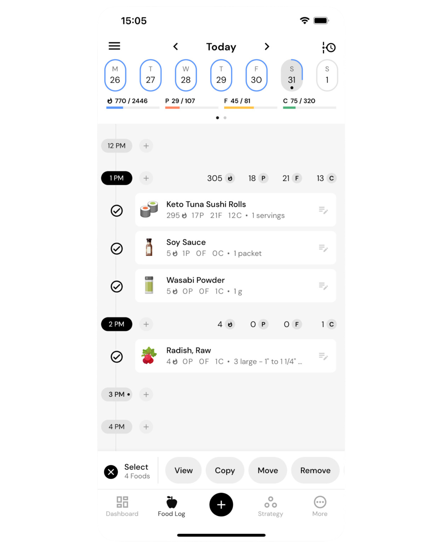
From the Selection Mode, users can View, Copy, Move, or Remove all foods in the clipboard. In the new timeline, they now also have access to new convenience utilities, such as modifying timestamps for groups of foods at a time or adding all selected foods to a new recipe directly from the timeline.
To demonstrate the speed advantage of the Tap-to-Select approach, here is how copying three foods worked in the previous version of the timeline and how it works now:
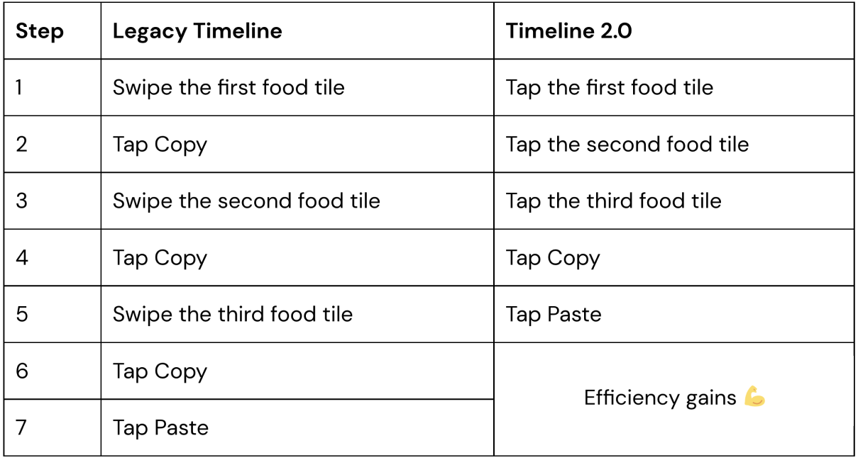
With the increased speed and a host of new features, MacroFactor’s timeline still draws heavily from its roots. It maintains its unique interactive nature by letting users manipulate foods in the context of the day in view. Once foods are selected, a user can choose to move foods to a particular hour or paste them to a different time slot, interacting directly with those hours within the timeline.
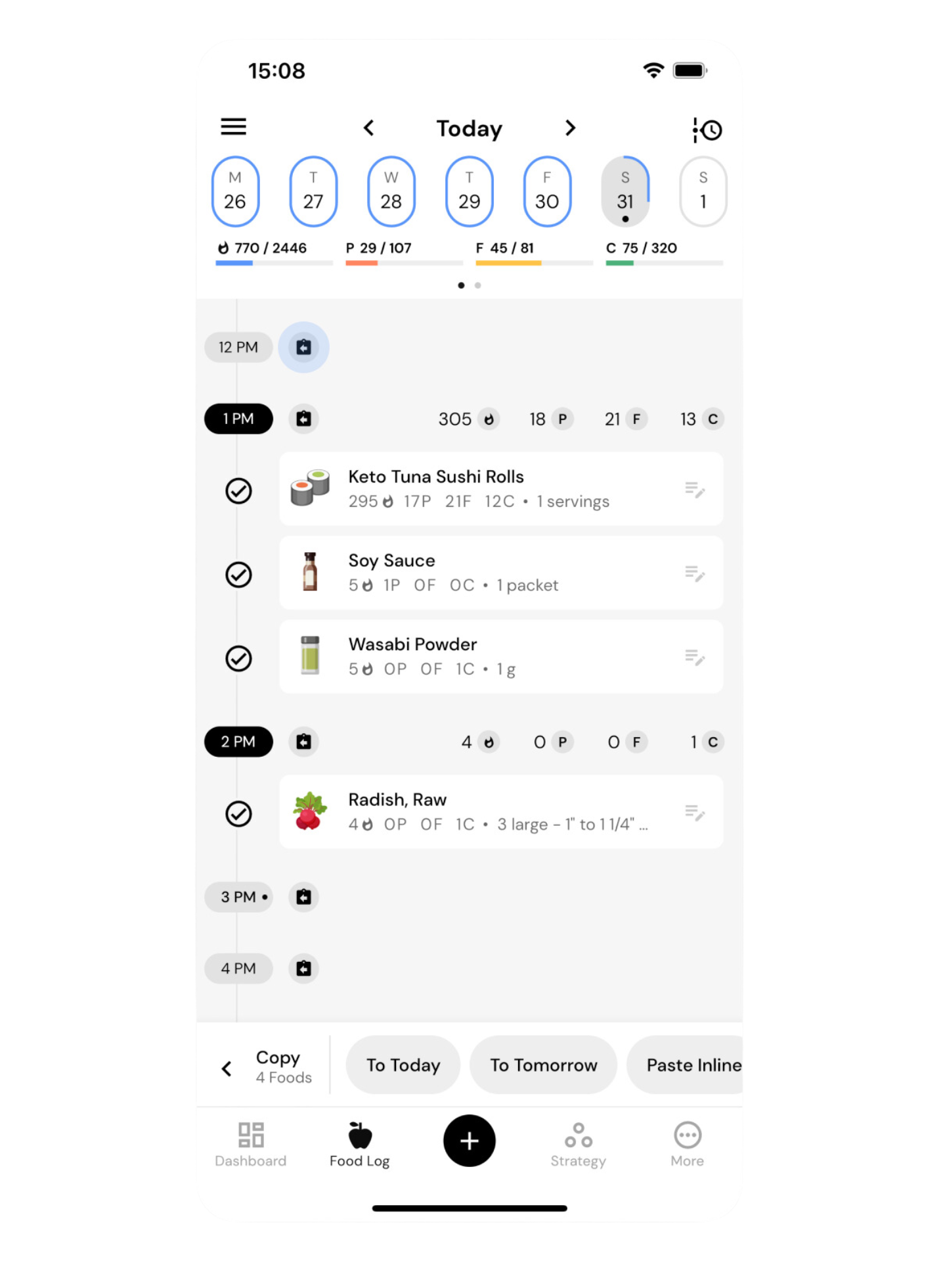
For example, tapping Copy from the Selection Mode will transition the timeline to the Copy Mode, with a dedicated Copy Toolbar taking over the bottom portion of the screen. In Copy Mode, the Add button next to each hour will transform into a Paste button, and tapping this button will paste foods in the clipboard to that hour. That way, users can navigate to days of interest and place foods exactly where they’d like to see them without using bottom-sheet selectors or date and time pickers that take them out of context.
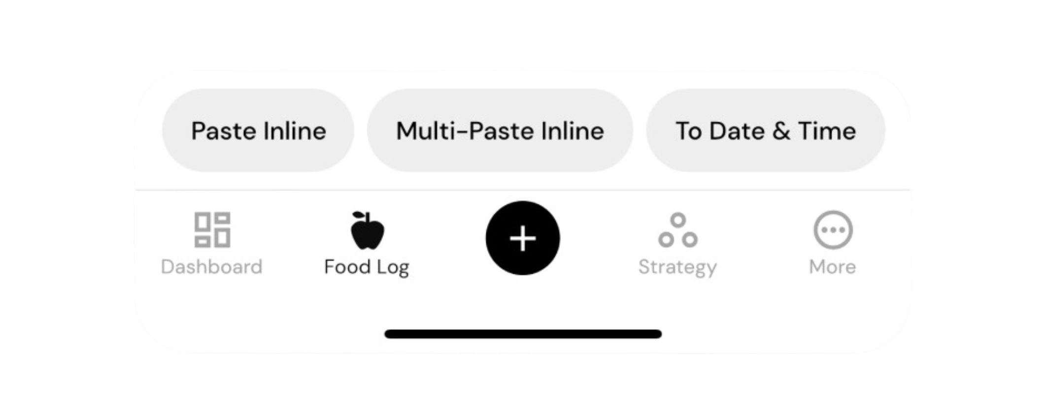
For those who plan their meals a day in advance, Copy and Move actions now have “To Today” and “To Tomorrow” shortcuts. These shortcuts follow the blueprint of the selected portions of the timeline and mirror them to the next day, whether you are copying from yesterday to today or today to tomorrow.
For those who prefer to do their planning for the week ahead, MacroFactor’s clipboard now has an intuitive way to paste across multiple days. The Multi-Paste feature in the Copy Toolbar will paste selected foods directly to the day in view, without removing them from the clipboard. Users can continue navigating to new days and Multi-Pasting until the entire week is planned out.
Premium timeline gets more faces to accommodate your unique food-logging style
By default, MacroFactor’s food log will reflect your entire day: foods you logged, when you logged them, periods in between feeding windows, nutrition profiles for those feeding windows, and nutrition profiles for the individual foods in the timeline.
With the revamped timeline, meal planners can tap on the Add shortcut next to any hour of the day to log to that hour in advance. They can later edit properties of pre-logged foods by tapping on the right-hand side of any food tile in view. While meal planning, having shortcuts for adding foods, insight into detailed nutrition profile of foods, and time between meals makes it easier to achieve the desired food log state.
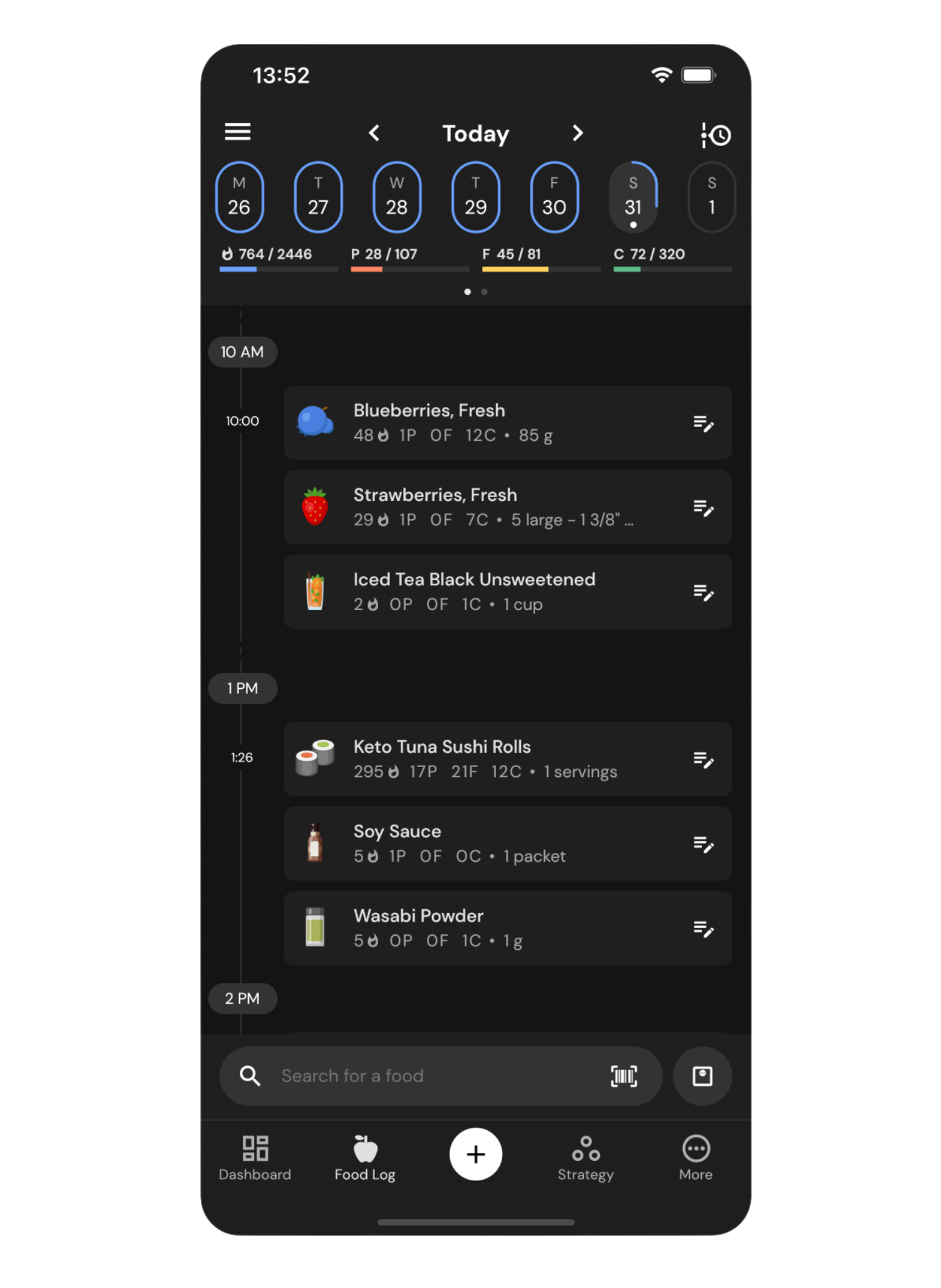
On the flip side, users who log in the moment during each meal may not need access to future hours of the day or macros for individual foods after the fact of logging. They can use the Search Toolbar to log their meals to the current time without interacting with empty hours or editing pre-logged foods at all.
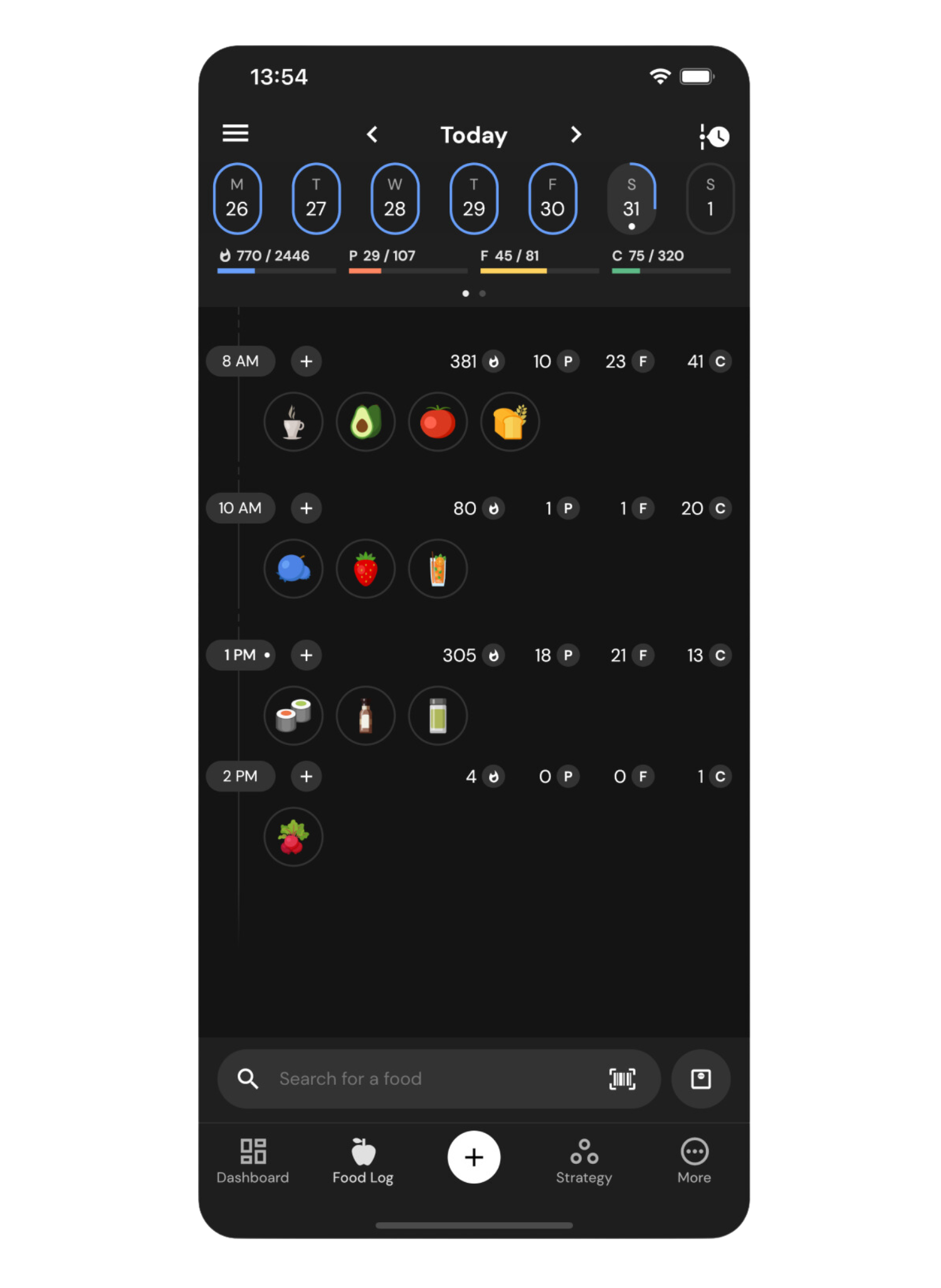
In-the-moment loggers may prefer to optimize their log for viewing the result rather than planning out their day, and now they can with the options to:
- Choose to display only the hours of the day during which they logged foods by using the option to Hide Empty Hours
- Collapse all foods within an hour to a single row, where each food becomes an interactive icon that can be selected and manipulated just as a food tile can
- Toggle hour-level macro summaries on or off
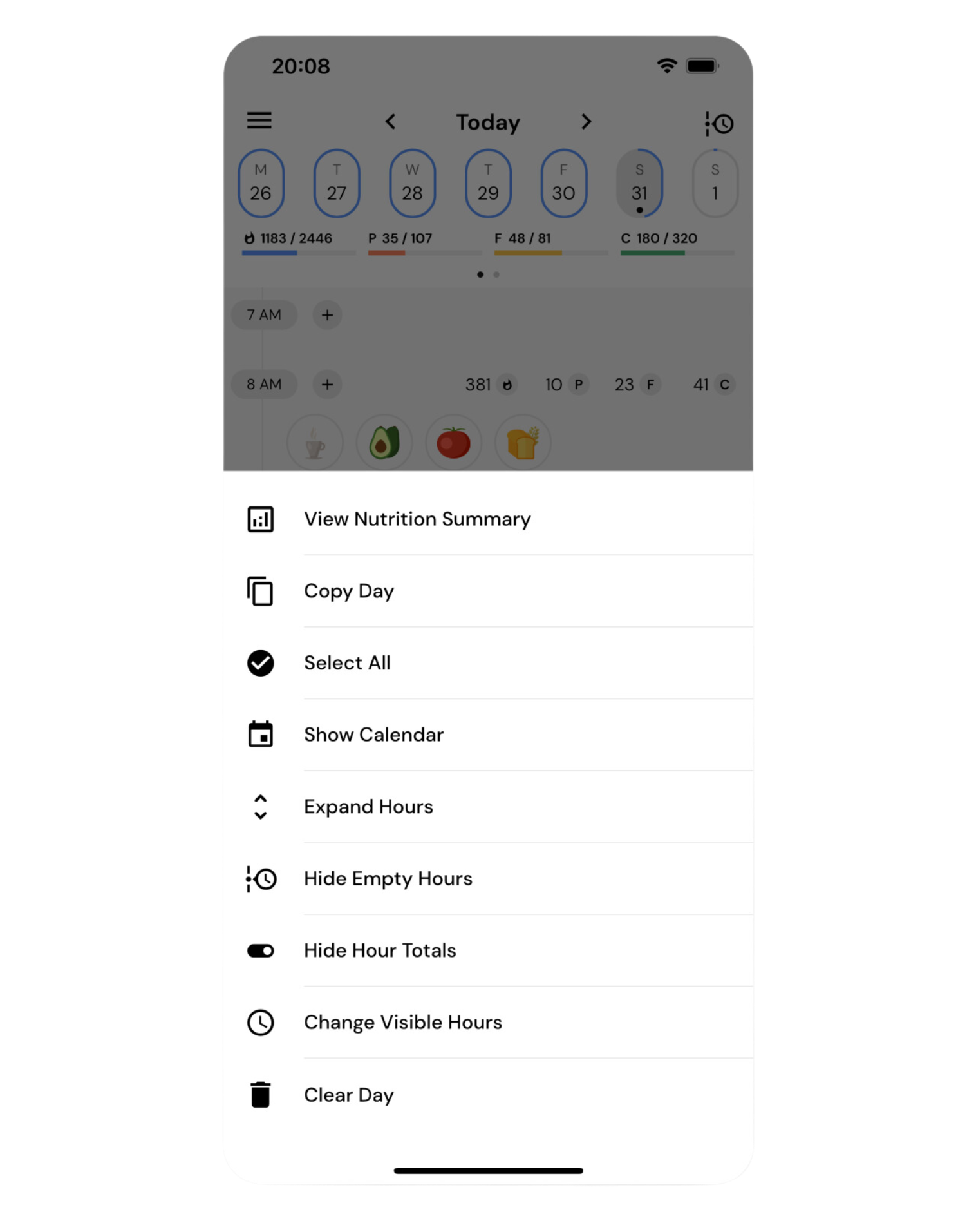
These change the face of the food log to match the needs of the moment. You can access them directly from the timeline’s top left menu.
Travel days at a time with the speed of a tap using the new interactive calendar
Plan out your week, easily reference your tracking habits, and go to any day of the week with just one tap using the new built-in calendar at the top of your timeline.
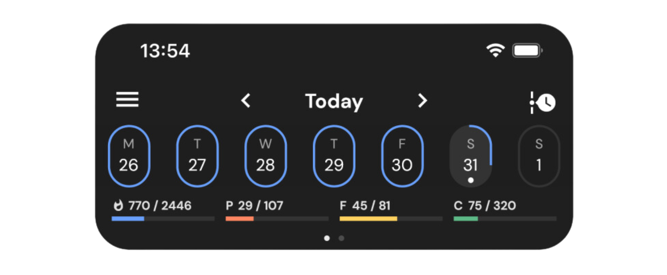
By default, the calendar banner displays the week in flight and how your consumption compares to your Calorie target for each day of the week. The oval target circles never turn orange or red, staying true to MacroFactor’s adherence-neutral approach, but they give users the context needed to navigate their food log and find specific days for Copy & Paste.
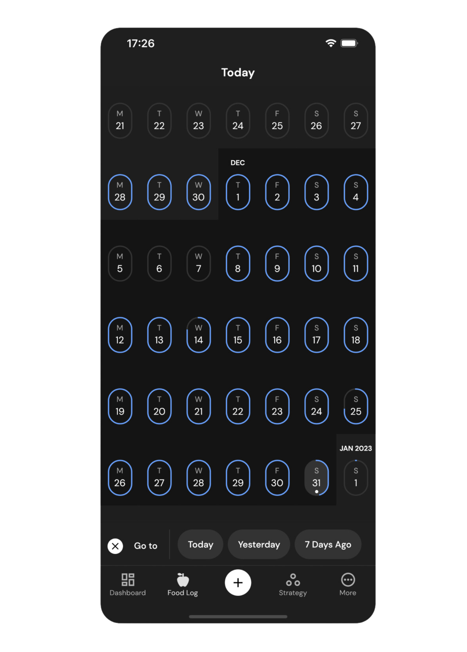
Tapping on the date in view expands the calendar banner into a full-page calendar experience that lets you travel weeks at a time with a single swipe. You can also use the Calendar toolbar shortcuts to jump to today, yesterday, or seven days ago.
Share recipes with friends and family directly from the food log
Editing timeline foods is now easier than ever before because MacroFactor’s custom keyboard is now available directly from the timeline’s Food Detail view.
For example, suppose a user taps to edit a recipe using the right-hand shortcut from the timeline. In that case, MacroFactor will immediately bring up the custom keyboard with the serving quantity preselected for editing and the most popular serving options front and center within the thumb’s reach.
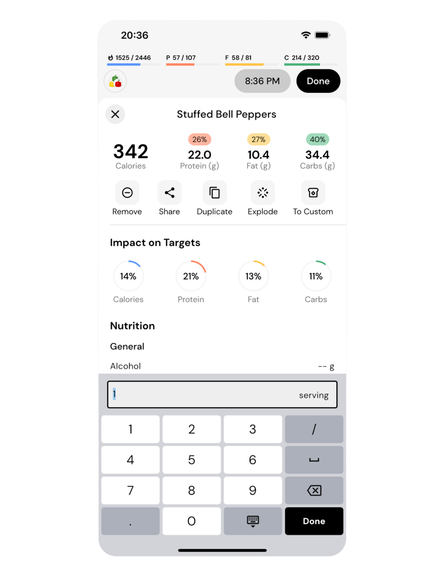
This Food Detail editing experience brings with it all the rich interactions available from the food log, so the user can also share the recipe they logged with their family and friends by tapping the Share button.
Choose from 4608 combinations of options to tailor your timeline to your needs
Timeline 2.0 release comes with more fluid interactions for the food log, more convenient nutrition reporting for your intake, new features, and faster workflows. It is also one of our most customizable experiences to date.
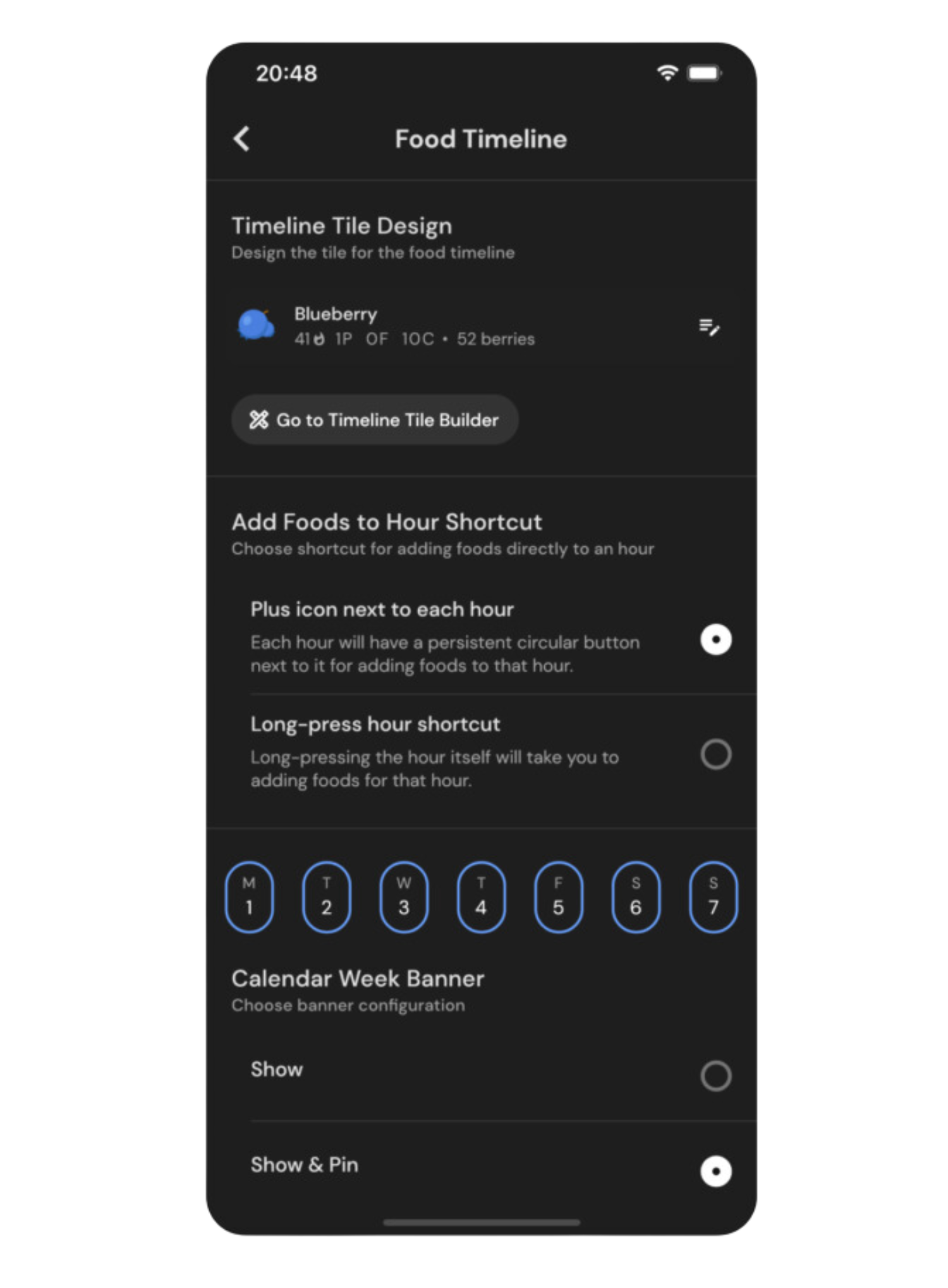
With this release, you can choose between left and right timeline alignment, configure your food tiles to display the information you care about, make some workflows even faster with optional shortcuts, and modify the appearance of the timeline interface.
Head on over to Food Timeline settings from MacroFactor’s More menu to discover how you can customize the new food logger to your preferences.